#read in packages
library(tidyverse)
library(here)
library(gt)
library(janitor)
library(readxl)

#read in data for personal data project
mydata <- read.csv("C:/Users/jlrum/MyGit/ENVS-193DS_homework-03/data/mydata.csv")Homework 3
Link to GitHub repository: https://github.com/jrumkin/ENVS-193DS_homework-03
Set Up
Problem 1: Personal Data
a. Data summarizing
I will be comparing the mean productivity score between two main groups, when I was alone and when I was accompanied for the study sessions in order to determine if working with other people increases my productivity, which is calculated from time spent working and how focused I was. This can help me determine if there is a statistical or significant difference between groups, because I feel like I spend more time on a task in one sitting when I am with other people, so I think my mean productivity will be higher in the accompanied group.
b. Visualization
#summarizing personal data
mydata_summary <-  mydata |> #make an object called mydata_summary using mydata file
  group_by(accompanied) |> #group the sumary by company type
  summarise(mean_score = round(mean(final_productivity_score),digits = 1), #find mean
            sd = round(sd(final_productivity_score), digits = 1), #find standard deviation
            se = round((sd(final_productivity_score)/sqrt(length(final_productivity_score))),digits = 1), #find standard error
            ci_lower = round(mean_score - 1.96 * (sd(final_productivity_score)/ sqrt(length(final_productivity_score))),digits = 1), #find lower confidence interval at 95%
            ci_upper = round(mean_score + 1.96 * (sd(final_productivity_score) / sqrt(length(final_productivity_score))),digits = 1) #find upper confidence interval at 95%
  )
#creating visualizations for personal data, Figure 1.
mydata_means <- ggplot(data = mydata, #use ggplot to create a visualization called mydata_means with data from mydata
aes(x = accompanied,
y = final_productivity_score,
color = accompanied)) +
geom_jitter(height = 0, #add geometry of jitter plot, 0 height jitter
width = 0.2, #0.2 jitter width
shape = 20) + #shape is open circles for the jitter points
geom_errorbar(data = mydata_summary, #add a geometry of an error bar from data of mydata_summary
aes(x = accompanied,
y = mean_score,
ymin = ci_lower,
ymax = ci_upper,
width = 0.12)) +
geom_point(data = mydata_summary, #add geometry of a point from mydata_summary of the mean productivity score
aes(x = accompanied,
y = mean_score),
inherit.aes = FALSE, #the geom_point layer will not inherit aesthitcs settings
color = "black", #point showing the mean is black
size = 2) +
labs(x = "Company Type", #labling the x and y axis and the title
y = "Final Productivity Score",
title = "Mean Productivity Score between \nAccompanied and Alone study sessions") +
scale_color_manual(values = c("Accompanied" = "#377b42", #manual colors for groups
"Alone" = "#AA71BA")) +
theme(legend.position = "none") #removing the legend for redundancy
mydata_means #display the visualization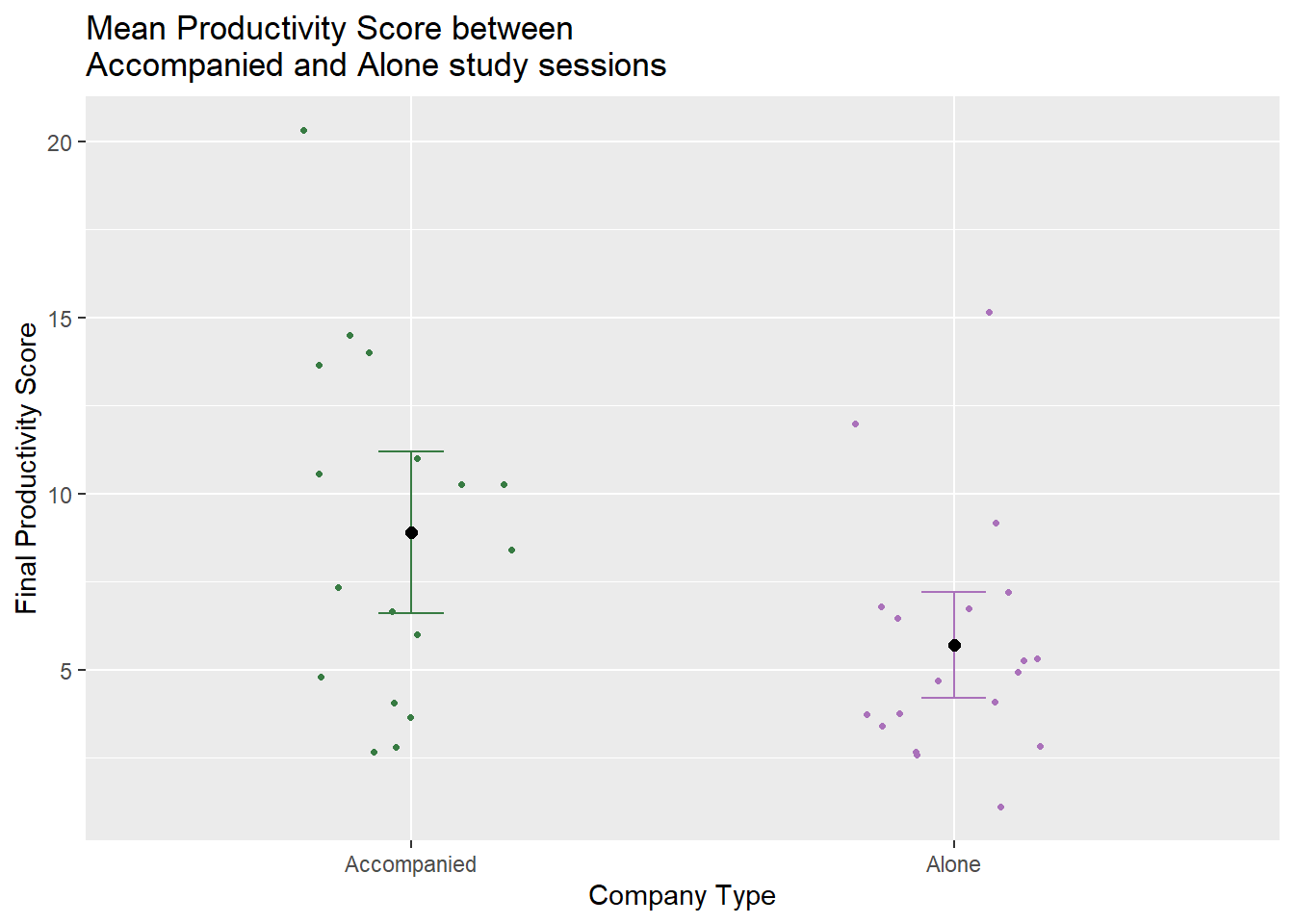
c. Caption
Figure 1. Average productivity scores are higher for accompanied study sessions compared to alone study sessions. The black point is the mean productivity score in each group, with error bars showing the confidence interval of the mean at a 95% confidence level, while open points represent individual data points. Colored by group type of accompanied (n = 17) and alone (n = 19).
d. Table presentation
#using gt package to make a table

summary_table <- gt(mydata_summary) |> # creating a summary table of final productivity score using the previously created mydata_summary
  cols_label( #manual labels for each column
    mean_score = "Mean Score",
    sd = "Standard Deviation",
    se = "Standard Error",
    ci_lower = "Confidence Interval, lower",
    ci_upper = "Confidence Interval, upper"
  ) |>
  tab_header( #title that appears above the table
    title = "Productivity Score Calculation Summary by Study Session Type"
  )

summary_table #print the table| Productivity Score Calculation Summary by Study Session Type | |||||
|---|---|---|---|---|---|
| accompanied | Mean Score | Standard Deviation | Standard Error | Confidence Interval, lower | Confidence Interval, upper |
| Accompanied | 8.9 | 4.9 | 1.2 | 6.6 | 11.2 |
| Alone | 5.7 | 3.4 | 0.8 | 4.2 | 7.2 |
Problem 2. Affective Visualization
a. Describe what an affective visualization could look like for personal data.
For my personality and executive function type I tend to get more done when I have external cues or deadlines, so I’m not surprised that my data shows I may get more done when I am working with others. I want my affective visualization to focus on the achievement of actually getting all that work done. Something I wasn’t expecting was that the plot is also a visualization of all my time and effort, so I also want the affective visualization to focus on accomplishment and not on comparison. When I think of progress or accomplishments in art I think of all the “climbing a mountain” analogies so I’m also thinking I will use that and have the mountain range represent the slope of my productivity over time.
#data exploration for affective visualization

mydata$date <- mdy(mydata$date) #changing the date field in mydata from character data to date data using the lubricate package

ggplot(data = mydata, #create a visualization using ggplot using mydata
       aes(x = date, #date field on x axis
           y = final_productivity_score)) + #final productivity score is on y axis
  geom_point() + #add scatter plot of productivity scores vs date
  geom_smooth(method = lm, se = FALSE) + #adds a line of best fit using linear model method and error shading is removed
  labs(x = "Date", #manual name for x axis name
       y = "Final Productivity Score", #manual name for y axis
       title = "Productivity Scores Throughout Spring Quarter 2025") #title name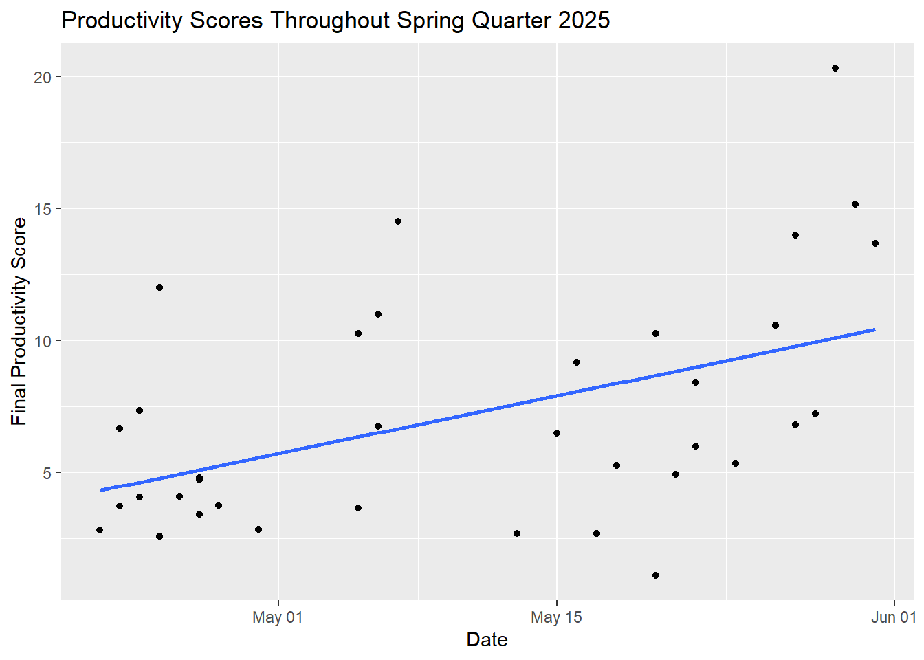
#plot shows that I was more productive as the quarter progressed, so I want the background to show that. I want the mountains in the background to show the lm line

#the other plot I want to use is the main visualization of productivity score by accompanied vs alone but I want to focus on the data points in the jitter, not the means or standard error.
b. Create a sketch (on paper) of your idea
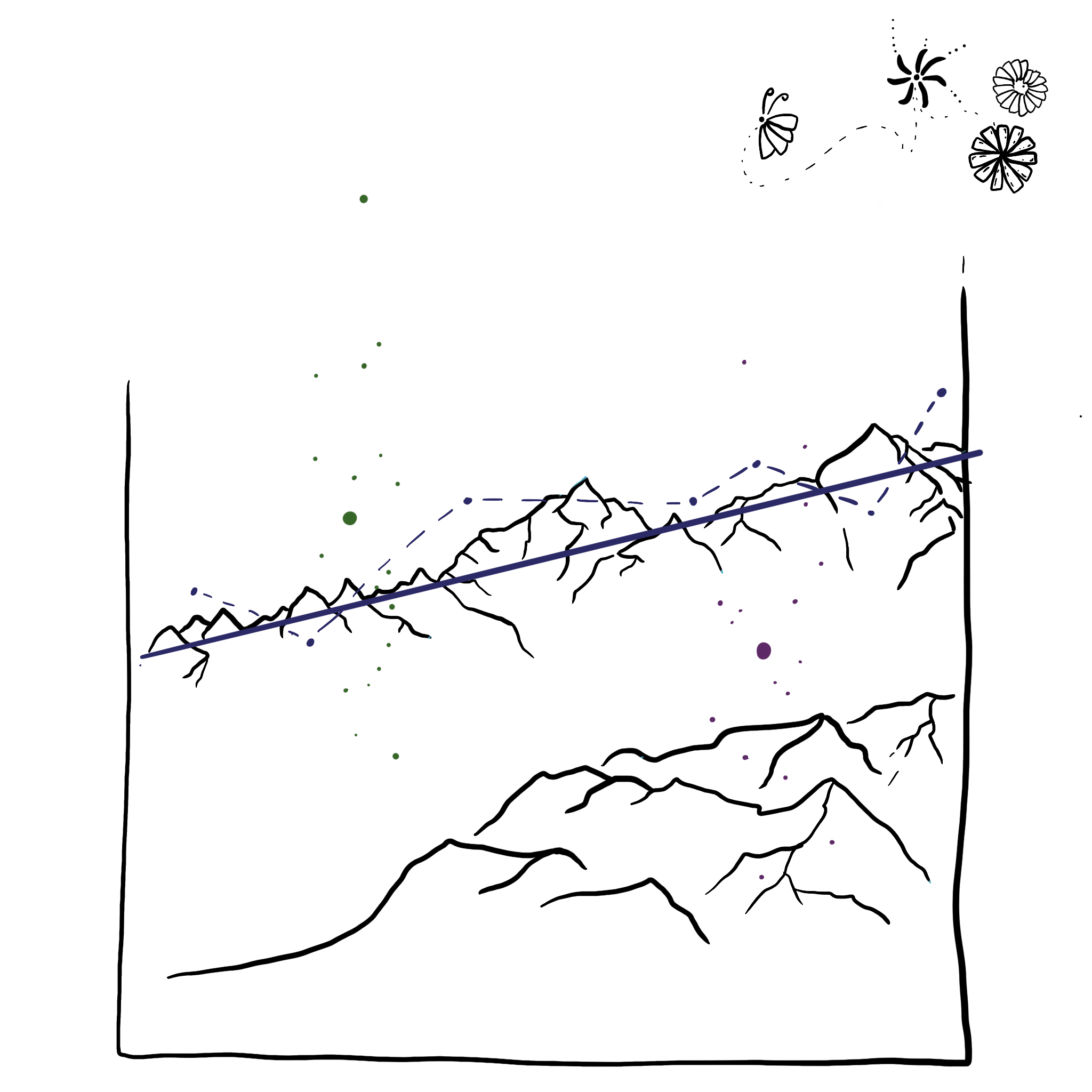
c. Make a draft of your visualization
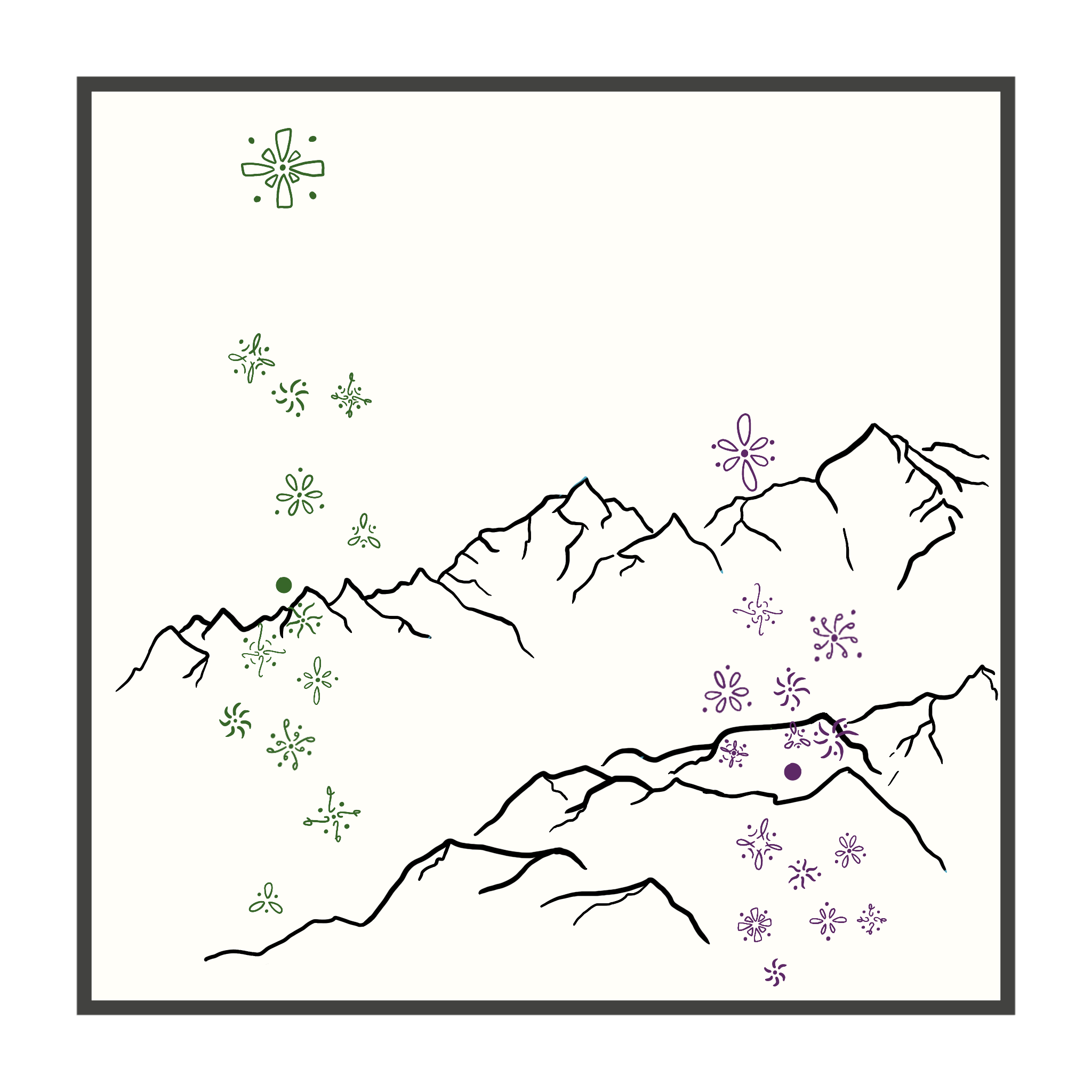
d. Write an artist statement
This data visualization shows my personal data on study habits and productivity throughout the Spring 2025 quarter. The green doodles are data points for when I studied with other people and the purple doodles are data points when I studied on my own, and each dot around or in each doodle represents my focus score for that study session. I took a lot of inspiration from Stefanie Posavec and Giorgia Lupi’s Dear Data project for representing data points as small illustrations. I drew the visualization on my iPad using an app called ProCreate. I started by putting a few of my ideas onto one page to see what I liked and honed the idea from there. I drew the mountain range first to represent the slope of my productivity scores over time. I then drew the data points based off the main jitter and mean plot created in Problem 1b and then drew the illustrations last while matching them to actual observations.
Problem 3. Statstical Critique
Paper Citation:
Robuck, A. R., Hudak, C. A., Agvent, L., Emery, G., Ryan, P. G., Perold, V., Powers, K. D., Pedersen, J., Thompson, M. A., Suca, J. J., Moore, M. J., Harms, C. A., Bugoni, L., Shield, G., Glass, T., Wiley, D. N., & Lohmann, R. (2022). Birds of a feather eat plastic Together: High levels of plastic ingestion in great shearwater adults and juveniles across their annual migratory cycle. Frontiers in Marine Science, 8. https://doi.org/10.3389/fmars.2021.719721
DOI: https://doi.org/10.3389/fmars.2021.719721
a. Revist and Summarize
These authors are using the Kruskill Wallis test to determine if there are differences between several different groups of bird region and age, and the variable being tested is plastic fragment size for both length and area.
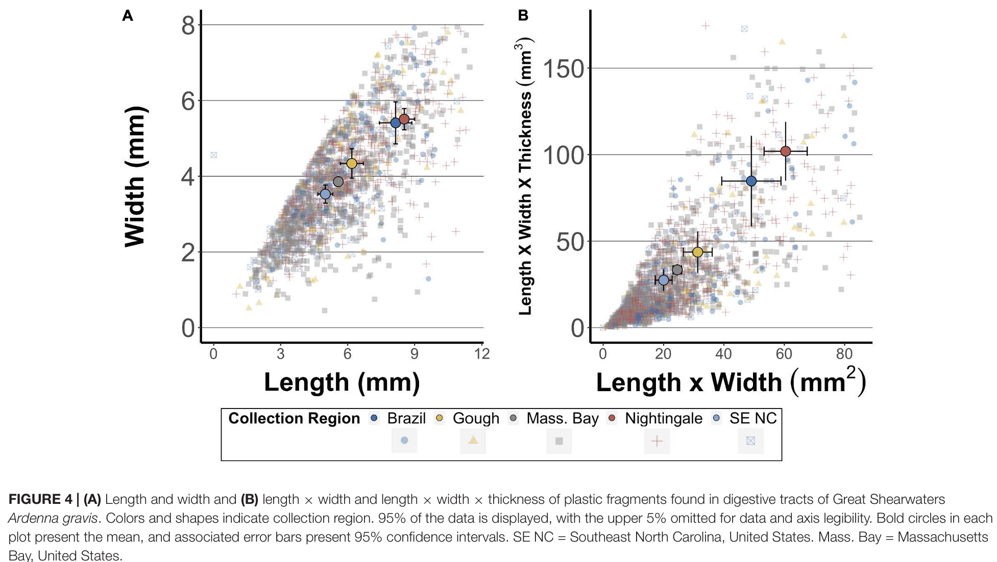
b. Visual clarity
The authors clearly label the axis and legend of this figure, but I wish the legend was more prominent or the figure included a title to explain the point of the figure. On first glance it looks like the take away is that as plastic fragments get longer, they get wider or have more surface area, but the actual take away is that certain regions have larger plastic fragments found in the birds from those regions. The summary statistic means are the main data points being displayed, and they also include 95% confidence interval error bars as well as underlying data. I like that the data is separated by color and shape, and while I understand why they excluded the upper 5% of data I would have like to seen it especially because the averages seem so much larger than were most of the data lies. I also noticed that figure 4b doesn’t have feet/tops to the error bars, which isn’t really a bad thing just something I noticed.
c. Aesthetic clarity
Figure 4 looks quite cluttered but I appreciate the effort that went into making it easier to look at. Each location has a different color and shape in the underlying data but because there is so much of it all the points just blur together into a brown grey color unless you zoom in a lot. I also don’t like the choice to exclude the upper 5% of the data points because the means look so much larger than where most of the data is, so it appears like the excluded outliers are having a large effect on the means. I think the data to ink ratio is decent but could be improved because they try to display a lot of data but the formatting and text size of the axis are too large in comparison to the legend which actually tells the reader the point of the graph.
d. Recomendations
I would like to see the upper 5% of data that was excluded from the graph, or if they are skewing the data that much I would like confirmation they were excluded from the mean calculations as well. I also would make the legend equally sized compared to the axes titles to emphasize the point of the figure. This could also be done with a title or if the caption included the main finding. I understand why a main finding isn’t always included in order to lessen bias when interpreting the data, but if there is nothing pointing towards the legend then I think it should be bigger.